Buttons usage
Download the UX Page Design Checklist (.ppt)
Buttons
Buttons consist of:
- Primary action (new, and replaces the old red primary action button)
- Secondary action button (ghost style button)
- Text buttons (black)
- Text buttons (red)
- Disabled
Each group of button sizes goes from small, medium, large, to extra large.
Pattern Library button usage information:
Problem summary:
Indicate to user what they can do on a page or application. And also indicate the level of importance for the various actions.
Solution:
Use buttons to indicate possible interactions the user can take.
Usage
- Disabled button indicates the action is not yet available (i.e. User must complete another action such as filling out the form, before the Submit button becomes available)
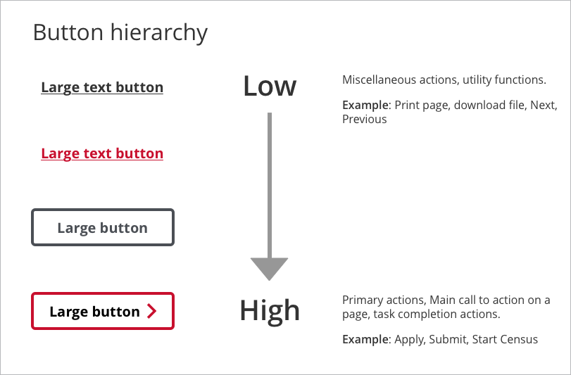
- Text button styles indicate smaller actions
- Primary action button can be used to indicate the most important action a user should take.
- Size of buttons (Small, Medium, Large, and Extra Large) indicate hierarchy of importance within a button group.

- Use a primary action button to indicate a task completion action, or a main call to action.
- Use lower level action buttons for utility type actions that don’t require immediate attention from the user (Example: Print, Next, Previous, etc.)
- Have a well defined hierarchy of actions from least to most important on the page/screen (use button sizes and button hierarchy to indicate hierarchy of actions).

- Avoid clutter on a page with too many action buttons as it increases the decision making time for the user and makes it difficult to understand what to do.
- Too many button actions can increase the cognitive load on the user.
- Multiple primary action buttons can make it more confusing for the user to understand what actions they should take. If you are unsure about what is the most important action on a screen, then the user will not know as well.
Buttons signal an opportunity for interactions to a user. Primary buttons (with icons) can be used to indicate the most important call to action in your user interface.
Avoid combining several primary buttons in any single user interface as this can confuse the user as to which action is most important for them to take.
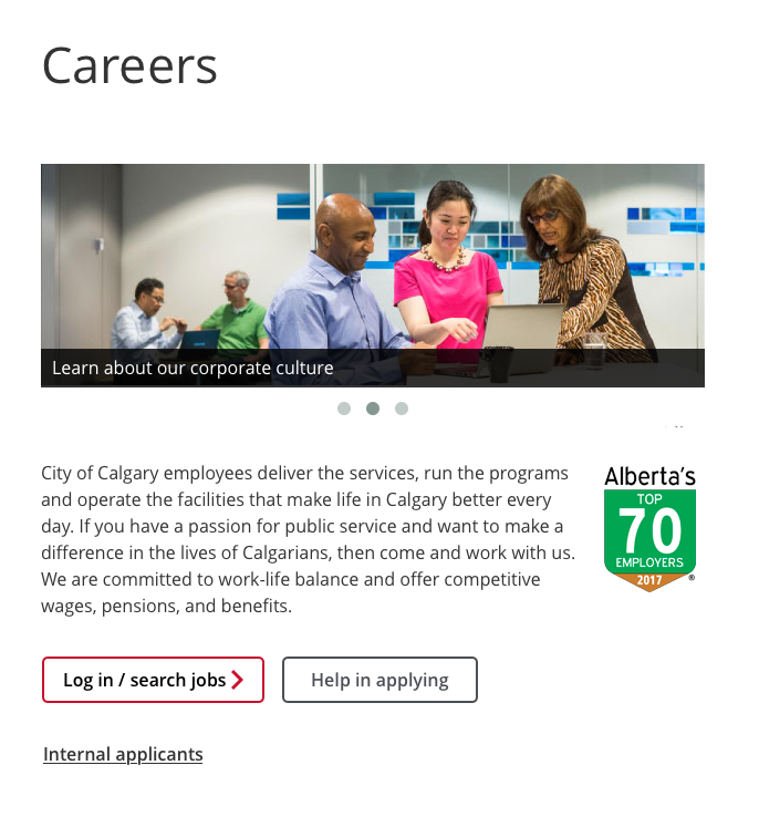
This page clearly identifies what the user should do; the submit button is the main Call to action. Create a personal/business account buttons are secondary buttons and do not detract from the main call.
Buttons should be used to create hierarchy within a page
Types of buttons
Primary – used for major call to action, indicates the main action for the user
Example:
Secondary – used for secondary page actions or utility functions
Example:
Fixed vs. fluid width Buttons
Fixed width buttons will remain the same size regardless of the screen they are viewed on. Fluid buttons and will expand or contract to fill the container – they are mobile compatible.
Disabled - A disabled button is unusable and un-clickable.
Example:

Sharepoint usage recommendation
By default, a <button> tag has the submit behavior when clicked. On Sharepoint, this can cause the page to refresh. To turn this submit behavior off, add the type="button" attribute to the button tag.