The button classes can be applied to both <button> and <a> elements. <button> elements should be used to trigger in-page functionality while <a> elements should be used for linking to pages.
Use the primary button style for the primary task or call to action of your page.
There are two variations available: With a right arrow icon and without.
With right arrow icon
Without icon
Code
<!-- Use the <button> tag if the element will be used to trigger in-page functionality -->
<button class="cui {{ btn-sm | btn-md | btn-lg | btn-xl }} primary">
	<span class="btn-wrapper">
		<span class="btn-text">
			{{ Button text }}
		</span>
		<!-- Optional arrow icon -->
		<span class="cicon-angle-right right" aria-hidden="true"></span>
	</span>
</button>

<!-- Use the <a> tag if the element is a link to a different page or section -->
<a class="cui {{ btn-sm | btn-md | btn-lg | btn-xl }} primary" href="{{ URL }}">
	<span class="btn-wrapper">
		<span class="btn-text">
			{{ Link text }}
		</span>
		<!-- Optional arrow icon -->
		<span class="cicon-angle-right right" aria-hidden="true"></span>
	</span>
</a>
Utility buttons
Use utility button style for all other actions on a page.
Code
<!-- Use the <button> tag if the element will be used to trigger in-page functionality -->
<button class="cui {{ btn-sm | btn-md | btn-lg | btn-xl }} utility-btn-solid">
    {{ Button text }}
</button>

<!-- Use the <a> tag if the element is a link to a different page or section -->
<a class="cui {{ btn-sm | btn-md | btn-lg | btn-xl }} utility-btn-solid" href="{{ URL }}">
    {{ Link text }}
</a>
Utlity buttons with icons
Utlity buttons with icon on left. Apply the class left on the cicon element for spacing between the text and the icon.
Utlity buttons with icon on right. Apply the class right on the cicon element for spacing between the text and the icon.
Code
<!-- Use any button size: btn-sm, btn-md, btn-lg, btn-xl -->

<!-- Use the <button> tag if the element will be used to trigger in-page functionality -->
<button class="cui {{ btn-sm | btn-md | btn-lg | btn-xl }}  utility-btn-solid }}">
    <!-- Add the left icon before the button text -->
    <span class="{{ Icon class (e.g. cicon-calendar) }} left" aria-hidden="true"></span>
    {{ Button text }}
    <!-- Or add the right icon after the button text -->
    <span class="{{ Icon class (e.g. cicon-calendar) }} right" aria-hidden="true"></span>
</button>

<!-- Use the <a> tag if the element is a link to a different page or section -->
<a class="cui {{ btn-sm | btn-md | btn-lg | btn-xl }} utility-btn-solid }}">
    <!-- Add the left icon before the link text -->
    <span class="{{ Icon class (e.g. cicon-calendar) }} left" aria-hidden="true"></span>
    {{ Link text }}
    <!-- Or add the right icon after the button text -->
    <span class="{{ Icon class (e.g. cicon-calendar) }} right" aria-hidden="true"></span>
</a>
Secondary / text buttons
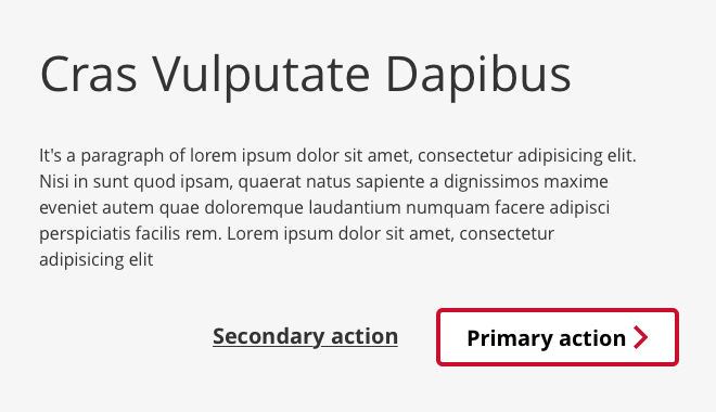
Secondary / text buttons can be used for miscellaneous actions on a page or as a secondary action that goes along with the primary button.
Code
<!-- Use the <button> tag if the element will be used to trigger in-page functionality -->
<button class="cui {{ btn-sm | btn-md | btn-lg | btn-xl }} {{ primary-text | secondary-text }}">
    {{ Button text }}
</button>


<!-- Use the <a> tag if the element is a link to a different page or section -->
<a class="cui {{ btn-sm | btn-md | btn-lg | btn-xl }} {{ primary-text | secondary-text }}" href="{{ URL }}">
    {{ Link text }}
</a>
Disabled buttons
To disable a button, it is recommended to apply the disabled attribute to the button. The disabled attribute can be applied to the primary, utility, and secondary / text buttons. The styles for disabled buttons will be the same regardless of the base styling class.
The disabled attribute should only be used for <button> tags. It is not recommended to disable link <a> tags.
Mega buttons can be used for vertical display of icons or illustratiive images with text. The graphical element can be positioned either above or below the button text.
Both the primary or utility button styles may be used.
Mega buttons with City of Calgary icons (cicons)
The icons are set to their maximum size of 3.2rem (32px).
Primary style
Utility style
Code
<!-- Icon on top -->

<!-- Use the <button> tag if the element will be used to trigger in-page functionality -->
<button class="cui btn-mega {{ primary | utility-btn-solid }}">
    <span class="{{ Icon class (e.g. cicon-home) }} top" aria-hidden="true"></span>
    <span class="text">{{ Button text }}</span>
</button>

<!-- Use the <a> tag if the element is a link to a different page or section -->
<a class="cui btn-mega {{ primary | utility-btn-solid }}" href=" {{ URL }} ">
    <span class="{{ Icon class (e.g. cicon-home) }} top" aria-hidden="true"></span>
    <span class="text">{{ Link text }}</span>
</a>


<!-- Icon on bottom -->

<!-- Use the <button> tag if the element will be used to trigger in-page functionality -->
<button class="cui btn-mega {{ primary | utility-btn-solid }}">
    <span class="text">{{ Button text }}</span>
    <span class="{{ Icon class (e.g. cicon-home) }} bottom" aria-hidden="true"></span>
</button>

<!-- Use the <a> tag if the element is a link to a different page or section -->
<a class="cui btn-mega {{ primary | utility-btn-solid }}" href=" {{ URL }} ">
    <span class="text">{{ Link text }}</span>
    <span class="{{ Icon class (e.g. cicon-home) }} bottom" aria-hidden="true"></span>
</a>
Mega buttons with SVG illustrative images
For larger graphics, use the SVG illustrative images designed by Creative Services. The images are set to their mimimum size of 6.4rem (64px). Read more information on SVG image usage.
As the illustrative images are for decorative purposes only, the alt attribute should be empty: alt="". Images with empty alt attributes will be ignored by assistive technologies.
Primary style
Utility style
Code
<!-- The alt attribute for the illustrative image should be empty: alt="" -->

<!-- Use the <button> tag if the element will be used to trigger in-page functionality -->
<button class="cui btn-mega {{ primary | utility-btn-solid }}">

	<!-- Use line below for Image on top -->
    <img class="cimg top" src="{{ Image URL (e.g. image.svg) }}" alt="">

    <span class="text">{{ Button text }}</span>

	<!-- Use line below for Image on bottom -->
    <img class="cimg bottom" src="{{ Image URL (e.g. image.svg) }}" alt="">

</button>

<!-- Use the <a> tag if the element is a link to a different page or section -->
<a class="cui btn-mega {{ primary | utility-btn-solid }}" href=" {{ URL }} ">

	<!-- Use line below for Image on top -->
    <img class="cimg top" src="{{ Image URL (e.g. image.svg) }}" alt="">

    <span class="text">{{ Button text }}</span>

	<!-- Use line below for Image on bottom -->
    <img class="cimg bottom" src="{{ Image URL (e.g. image.svg) }}" alt="">

</a>
Fluid width buttons
By default, buttons will take up the width of the content inside them. Add the btn-fluid class to create fluid-width buttons that span the full width of their parent containers.
Code
<!-- Use the <button> tag if the element will be used to trigger in-page functionality -->
<button class="cui btn-fluid {{ btn-sm | btn-md | btn-lg | btn-xl }} {{ primary | utility-btn-solid | primary-text | secondary-text }}">
	<span class="btn-wrapper">
		<span class="btn-text">
		{{ Button text }}
		</span>
	</span>
</button>

<!-- Use the <a> tag if the element is a link to a different page or section -->
<a class="cui btn-fluid {{ btn-sm | btn-md | btn-lg | btn-xl }} {{ primary | utility-btn-solid | primary-text | secondary-text }}" href="{{ URL }}">
    <span class="btn-wrapper">
		<span class="btn-text">
		{{ Link text }}
		</span>
	</span>
</a>
Usage
General guidelines
When using buttons (or links styled as buttons) on your page, review the UX page design checklist (.ppt) to ensure the buttons on your page follow user experience best practices.
Primary (red bordered button)
The primary button style is used to indicate the most important action a user should take. Consider what your page is about and the main action you want your user to take. The primary button should be used for directing your user to the main action on the page. This will help your user to understand what your page is about.
Add the right arrow icon option to further encourage users to take the action.
Try to feature this primary button prominently within your page layout.
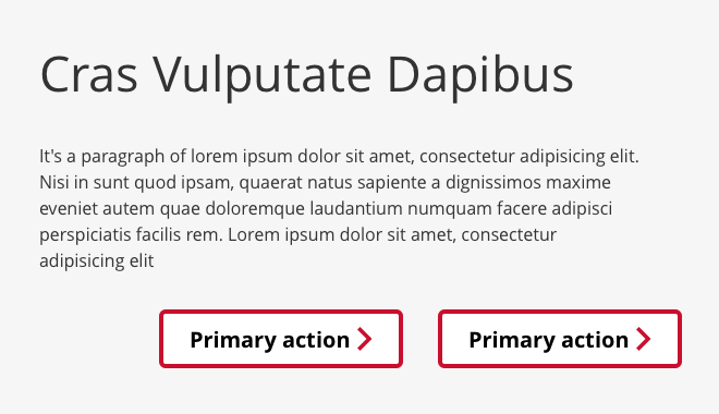
If you find yourself using multiple instances of the primary on a page this is a sign you may have too many tasks for the user. Instead of drawing more attention to user tasks, multiple primary buttons on a page adds additional cognitive load on to the user
Do not use different icons with the Primary button style.
Utility (dark grey bordered button)
The utility button style indicates smaller actions. Utility buttons are used for all other actions on a page. An example of this usage is to print the web page or download a PDF file.
An easy way to decide on using a utility button is if it is for something a user needs to do to complete their tasks, but it is not the reason they came to the content page (i.e. printing a web page).
Adding icons to these utility buttons can visually aid the action you are getting the user to do. (i.e. A printer to show they can print the web page).
The dark grey colour is designed to indicate a possible action, but not compete visually with the primary button on the page.
Secondary / text buttons (red or dark grey)
The secondary / text button style indicate smaller action. It can be used alongside the primary button.
The disabled attribute can be used to prevent a user from clicking the button until some other condition has been met (for example: selecting a checkbox, filling in an input, etc.). Once the condition has been met, JavaScript can be used to remove the disabled attribute rendering the button usable.
The disabled class or attribute should only be used for <button> tags. It is not recommended to disable link <a> tags.
Include the aria-disabled="true" attribute on disabled buttons to indicate the disabled state to assistive technologies.
Button size: Each group of button sizes goes from small, medium, large, to extra large. The size of buttons indicate hierarchy of importance. The larger the button, the more important it is.
Please DO
Use a primary button to indicate the main call to action or the task completion action.
Use the utility or secondary / text buttons to indicate lower level actions that do not require immediate attention from the user. For example: Print, Next, Previous, etc.
Have a well defined hierarchy of actions on the page. Use the button styles and button sizes to visually indicate the hierarchy of actions.
Please DON’T
Avoid cluttering a page with too many buttons. This can increase cognitive load on a user, increase the decision making time for the user and make it difficult to understand what to do.
Multiple primary buttons can make it confusing for the user to determine what actions they should take. If you are unsure what the most important action on the page is, then the user will be unsure as well.
Sharepoint usage recommendation
By default, a <button> tag has the submit behavior when clicked. On Sharepoint, this can cause the page to refresh. To turn this submit behavior off, add the type="button" attribute to the button tag.