Alert banner
Alert banners are used as prominent visual cues for communicating messages to users. There are two styles of alert banners available for use: global and inline. Refer to the usage page for further details.
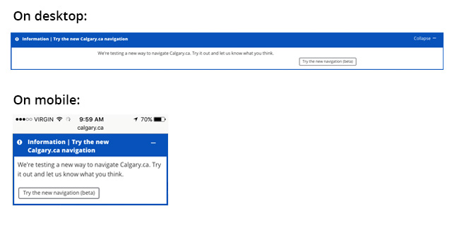
Global alerts
The global alert banner can be used to communicate important site-wide messages, warnings, or emergency information. It is recommended to place the global alert banner at the top of the page.
Global alerts can be also contain buttons that close or minimize the alert. JavaScript is required for this functionality. Example JavaScript is provided in the code block below.
Demo
Use the select box below to view the available alert types.
Code
<!--
    Alert types: warning, error, caution, information, success
    Icons:
        Warning or Error - Use `cicon-exclamation-triangle`
        Caution - Use `cicon-exclamation-diamond`
        Information - Use `cicon-exclamation-circle`
        Success - Use `cicon-check-circle`
-->

<div class="cui alert-banner global {{ warning | error | caution | information | success }}"
    role="alertdialog" aria-labelledby="{{ Alert title id }}" aria-describedby="{{ Alert description id }}">
    <div class="alert-header">
        <span class="alert-icon {{ cicon-exclamation-triangle | cicon-exclamation-diamond | cicon-exclamation-circle | cicon-check-circle }}" aria-hidden="true"></span>
        <h2 id="{{ Alert title id }}" class="alert-title">{{ Alert Type }} <span aria-hidden="true">|</span> {{ Alert title }}</h2>

        <!-- Optional alert action buttons to close or minimize the alert. Use only one per alert.
             JavaScript is required; see example JavaScript below.
        <!-- Optional minimize alert button -->
        <button class="alert-action-btn cui btn-md" data-action="close"><span class="text">Close</span><span class="cicon-close-thin-large right" aria-hidden="true"></span>
        </button>

        <!-- Optional close alert button -->
        <button class="alert-action-btn cui btn-md" data-action="minimize"><span class="text">Minimize</span><span class="cicon-minuse-thin right" aria-hidden="true"></span>
        </button>
    </div>
    <div class="alert-body">
        <p id="{{ Alert description id }}">{{ Alert description }}</p>
        <!-- Optional call-to-action links -->
        <a class="cui btn-sm utility-btn" href="{{ URL }}">{{ Call to action text }}</a>
        <a class="cui btn-sm secondary-text" href="{{ URL }}">{{ Secondary call to action text }}</a>
    </div>
</div>

<!-- Example JS to configure the close or minimize alert buttons -->
<script src="js/jquery-2.2.4.min.js"></script>
<script>
    $( document ).ready( function() {
        $( '.alert-action-btn' ).click( function() {
            var btn = $( this );
            var actionType = btn.attr( 'data-action' );
            var alertEl = btn.parents( '.alert-banner' );
            if ( actionType === 'close' ) {
                alertEl.hide();
            }
            else if ( actionType === 'minimize' ) {
                var alertBody = alertEl.find( '.alert-body' );
                var btnText = btn.find( '.text' );
                var btnIcon = btn.find( '[class*="cicon-"]' );
                if ( alertBody.is( ':visible' ) ) {
                    alertBody.hide();
                    btnText.text( 'Expand' );
                    btnIcon.attr( 'class', 'right cicon-plus-thin' );
                }
                else {
                    alertBody.show();
                    btnText.text( 'Minimize' );
                    btnIcon.attr( 'class', 'right cicon-minus-thin' );
                }
            }
        });
    });
</script>
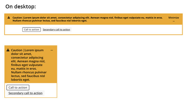
Inline alerts
Inline alerts can be condensed to one line to contain a concise message and an optional call to action.
Or the inline alert can be expanded to separately call out the title, the message, and a call to action.
Demo
Use the select box below to view the available alert types.
Code
<!--
    Alert types: warning, error, caution, information, success
    Icons:
        Warning or Error - Use `cicon-exclamation-triangle`
        Caution - Use `cicon-exclamation-diamond`
        Information - Use `cicon-exclamation-circle`
        Success - Use `cicon-check-circle`
-->

<!-- Short inline variant -->
<div class="cui alert-banner inline {{ warning | error | caution | information | success }}"
role="alertdialog" aria-labelledby="{{ Alert title id }}">
    <div class="alert-body">
        <span class="alert-icon {{ cicon-exclamation-triangle | cicon-exclamation-diamond | cicon-exclamation-circle | cicon-check-circle }}" aria-hidden="true"></span>
        <h2 id="{{ Alert title id }}" class="alert-title">
            {{ Alert Type }}<span class="font-weight-normal"> <span aria-hidden="true">|</span> {{ Alert title }}
            <a href="{{ URL }}">{{ Call to action text }}</a></span>
        </h2>
    </div>
</div>

<!-- Long inline variant -->
<div class="cui alert-banner inline {{ warning | error | caution | information | success }}"
role="alertdialog" aria-labelledby="{{ Alert title id }}" aria-describedby="{{ Alert description id }}">
    <div class="alert-body">
        <span class="alert-icon {{ cicon-exclamation-triangle | cicon-exclamation-diamond | cicon-exclamation-circle | cicon-check-circle }}" aria-hidden="true"></span>
        <h2 id="{{ Alert title id }}" class="alert-title">{{ Alert Type }} <span aria-hidden="true">|</span> {{ Alert title }}</h2>
        <p id="{{ Alert description id }}">{{ Alert description }}</p>
        <a href="#" class="cui btn-sm utility-btn">{{ Call to action text }}</a>
    </div>
</div>
Usage
General guidelines
There are 4 alert types available. Each of these are colour-coded to match the type of alert it should contain.
| Class name | Colour | Recommended icon | Usage |
|---|---|---|---|
warning or error |
red | cicon-exclamation-triangle |
Used to display warnings, errors, or emergency messages.
|
caution |
yellow | cicon-exclamation-diamond |
Used to display cautionary messages.
|
information |
blue | cicon-exclamation-circle |
Used to display general information messages.
|
success |
green | cicon-check-circle |
Used to indicate an action has been completed successfully.
|
The banner title should be concise and descriptive. Avoid long sentences. The recommended character limit is 50. It is recommended to include the alert type prior to the title. For example “Error | Your form could not be submited due to the following errors…” or “Success | Your request has been submitted.”
The banner description or message should contain further details about the subject or warning. The recommended character limit is 255.
The call-to-action link should direct users to further information, if applicable. Ensure the text is concise and direct.
The alert icon serves as a visual cue to correlate with the type of alert. Refer to the table above to see the recommended icon for each alert type.
Please DO
- Keep the title short.
- Ensure the description is clear.
- Use simple and direct language for the call-to-action.
Please DON'T
- Do not write a long title.
- Do not forget to write a description to provide additional context.
- Do not make the call-to-action text too long.