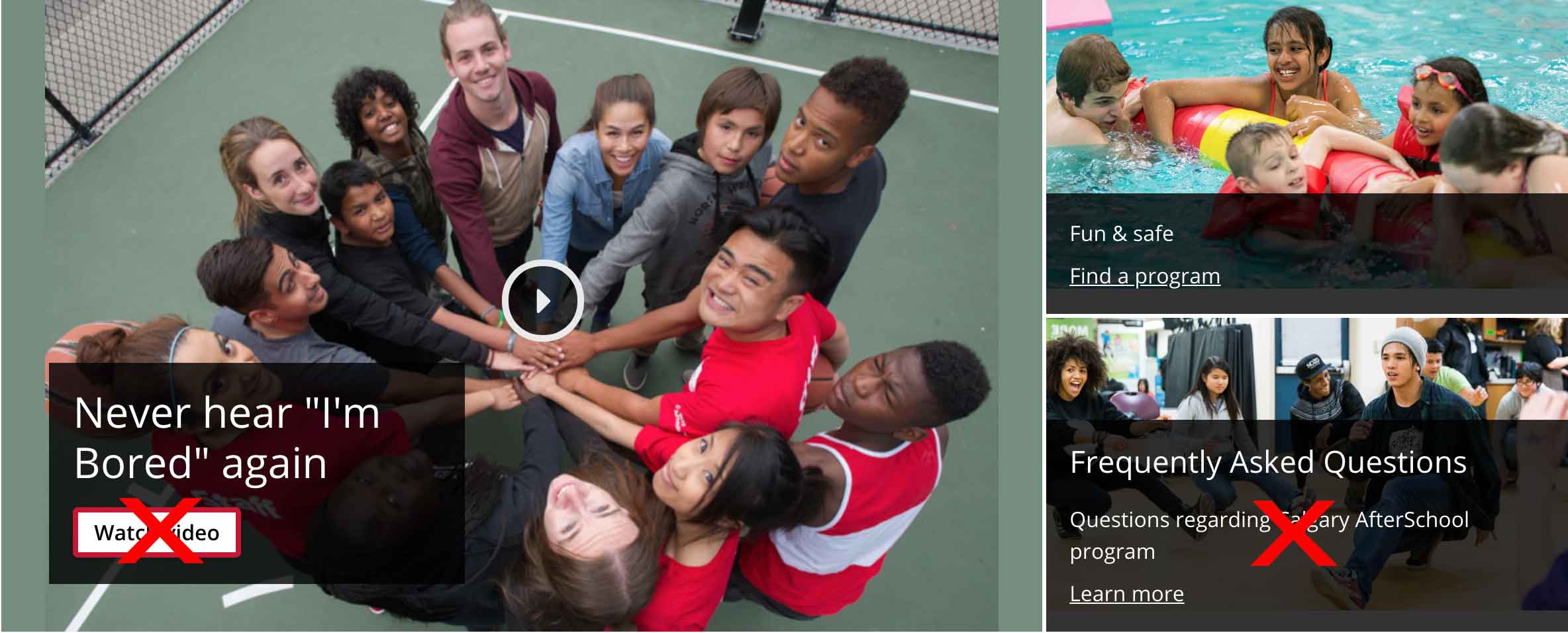
In this variant, any combination of the three grid items may be converted to video containers. When the video container is clicked, the video will display and play. There should not be any call to action links in the video container grid item as the main purpose of the element is to play the video.
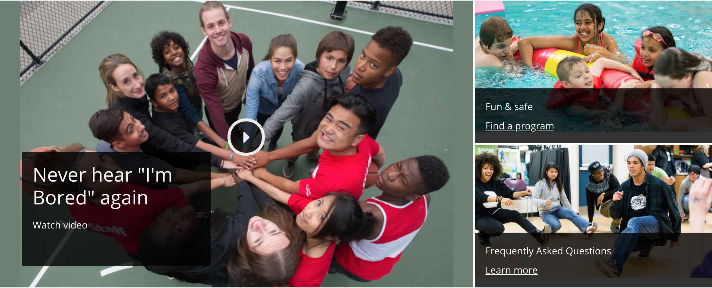
Demo
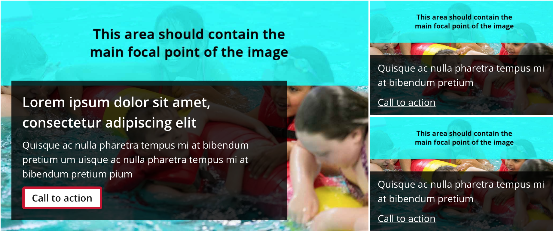
Example title lorem ipsum dolor sit amet
Lorem ipsum dolor sit amet, consectetur adipiscing elit.
Quisque ac nulla pharetra tempus mi at bibendum pretium
Quisque ac nulla pharetra tempus mi at bibendum pretium
Grid banners are composed of three grid items composed of a high quality background image, a heading, and a short description (for the main area only).
Grid banners should be placed at the top of the page beneath the navigation.
All grid items with static images require one call to action link inside the content area. For grid items with videos, do not include any call to action in the content area as the only action available will be to watch the video.
Text guidelines
Recommended character limits
Character limits should be placed on the content to ensure the pattern does not look visually cluttered. Below are recommended limits.
Main column
Title: 50-60 characters
Content: 100-120 characters
Side column
Title: 50-60 characters
Please DO
Use the recommended character limits above.
Use only one call to action link or button per grid item.
Add a short description to the main grid item.
Please DON'T
Do not exceed the text character limits to prevent breaking the layout.
Do not use a call to action link or button in conjunction with a video grid item.
Do not add a description for the side grid items.
Background image template
A background image template is available to guide the placement of the image’s focal point. This ensures the image is displayed properly when the pattern is viewed across various screen sizes.