Content block
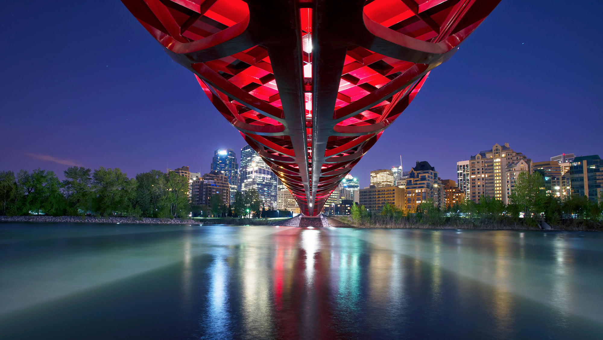
The content block provides a stylized two-column layout for content and a decorative image. Use this pattern when you want to showcase information with an image. This pattern is similar to the hero banner except it allows for longer content.
Columns widths can be set to one and two thirds, two and one thirds, and one half and one half. The image and content columns may also be switched. This results in 6 different layout options.
Image height variants
The image can have 4 different heights: small, medium, large, or flexible.
The small, medium, large variants are fixed heights set through CSS.
The flexible height means the image will stretch vertically to match the height of the content column. Therefore, the image will always be 100% height of the entire content block.
Demo
Mix and match the options below to see the flexibility of the content block.
Example title lorem ipsum neque porro quisquam est
Lorem ipsum dolorExample content neque porro quisquam est qui dolorem ipsum, neque porro quisquam est qui dolorem. Neque porro quisquam est qui dolorem ipsum, neque porro quisquam est qui dolorem.
Lorem ipsum dolor sit amet, consectetur adipiscing elit. Ut quis ante eu dui porttitor mollis. Nam elementum diam eget posuere tincidunt. Nulla ut fringilla arcu. Praesent eget convallis mi. Praesent lobortis convallis erat sed tempor.
Example CTACode
Fixed image height
Code
<!-- NOTE: For fixed height background-images, add a sizing class: `sm`, `md`, or `lg`
to the `<div class="background-image">` element to set the fixed height -->

<!-- 1/3 fixed height image, 2/3 content -->
<div class="content-block-flex row no-gutters fixed-image-height">
    <div class="content-block-media col-sm-6 col-md-4">
        <img class="mobile-image" src="{{ Image URL (e.g. image.jpg) }}" alt="">
        <div class="background-image {{ sm | md | lg }}" style="background-image: url( '{{ Image URL (e.g. image.jpg) }}' );"></div>
    </div>
    <div class="content-block-body col-sm-6 col-md-8">
        {{ Content }}
    </div>
</div>

<!-- 2/3 fixed height image, 1/3 content -->
<div class="content-block-flex row no-gutters fixed-image-height">
    <div class="content-block-media col-sm-6 col-md-8">
        <img class="mobile-image" src="{{ Image URL (e.g. image.jpg) }}" alt="">
        <div class="background-image {{ sm | md | lg }}" style="background-image: url( '{{ Image URL (e.g. image.jpg) }}' );"></div>
    </div>
    <div class="content-block-body col-sm-6 col-md-4">
        {{ Content }}
    </div>
</div>

<!-- 1/2 fixed height image, 1/2 content -->
<div class="content-block-flex row no-gutters fixed-image-height">
    <div class="content-block-media col-sm-6">
        <img class="mobile-image" src="{{ Image URL (e.g. image.jpg) }}" alt="">
        <div class="background-image {{ sm | md | lg }}" style="background-image: url( '{{ Image URL (e.g. image.jpg) }}' );"></div>
    </div>
    <div class="content-block-body col-sm-6">
        {{ Content }}
    </div>
</div>

<!-- 2/3 content, 1/3 fixed height image -->
<div class="content-block-flex row no-gutters fixed-image-height">
    <div class="content-block-body col-sm-6 col-md-8">
        {{ Content }}
    </div>
    <div class="content-block-media col-sm-6 col-md-4">
        <img class="mobile-image" src="{{ Image URL (e.g. image.jpg) }}" alt="">
        <div class="background-image {{ sm | md | lg }}" style="background-image: url( '{{ Image URL (e.g. image.jpg) }}' );"></div>
    </div>
</div>

<!-- 1/3 content, 2/3 fixed height image -->
<div class="content-block-flex row no-gutters fixed-image-height">
    <div class="content-block-body col-sm-6 col-md-4">
        {{ Content }}
    </div>
    <div class="content-block-media col-sm-6 col-md-8">
        <img class="mobile-image" src="{{ Image URL (e.g. image.jpg) }}" alt="">
        <div class="background-image {{ sm | md | lg }}" style="background-image: url( '{{ Image URL (e.g. image.jpg) }}' );"></div>
    </div>
</div>

<!-- 1/2 content, 1/2 fixed height image -->
<div class="content-block-flex row no-gutters fixed-image-height">
    <div class="content-block-body col-sm-6">
        {{ Content }}
    </div>
    <div class="content-block-media col-sm-6">
        <img class="mobile-image" src="{{ Image URL (e.g. image.jpg) }}" alt="">
        <div class="background-image {{ sm | md | lg }}" style="background-image: url( '{{ Image URL (e.g. image.jpg) }}' );"></div>
    </div>
</div>
Flexible image height
Code
<!-- 1/3 flexible height image, 2/3 content -->
<div class="content-block-flex row no-gutters flexible-image-height">
    <div class="content-block-media col-sm-6 col-md-4">
        <img class="mobile-image" src="{{ Image URL (e.g. image.jpg) }}" alt="">
        <div class="background-image" style="background-image: url( '{{ Image URL (e.g. image.jpg) }}' );"></div>
    </div>
    <div class="content-block-body col-sm-6 col-md-8">
        {{ Content }}
    </div>
</div>

<!-- 2/3 flexible height image, 1/3 content -->
<div class="content-block-flex row no-gutters flexible-image-height">
    <div class="content-block-media col-sm-6 col-md-8">
        <img class="mobile-image" src="{{ Image URL (e.g. image.jpg) }}" alt="">
        <div class="background-image" style="background-image: url( '{{ Image URL (e.g. image.jpg) }}' );"></div>
    </div>
    <div class="content-block-body col-sm-6 col-md-4">
        {{ Content }}
    </div>
</div>

<!-- 1/2 flexible height image, 1/2 content -->
<div class="content-block-flex row no-gutters flexible-image-height">
    <div class="content-block-media col-sm-6">
        <img class="mobile-image" src="{{ Image URL (e.g. image.jpg) }}" alt="">
        <div class="background-image" style="background-image: url( '{{ Image URL (e.g. image.jpg) }}' );"></div>
    </div>
    <div class="content-block-body col-sm-6">
        {{ Content }}
    </div>
</div>

<!-- 2/3 content, 1/3 flexible height image -->
<div class="content-block-flex row no-gutters flexible-image-height">
    <div class="content-block-body col-sm-6 col-md-8">
        {{ Content }}
    </div>
    <div class="content-block-media col-sm-6 col-md-4">
        <img class="mobile-image" src="{{ Image URL (e.g. image.jpg) }}" alt="">
        <div class="background-image" style="background-image: url( '{{ Image URL (e.g. image.jpg) }}' );"></div>
    </div>
</div>

<!-- 1/3 content, 2/3 flexible height image -->
<div class="content-block-flex row no-gutters flexible-image-height">
    <div class="content-block-body col-sm-6 col-md-4">
        {{ Content }}
    </div>
    <div class="content-block-media col-sm-6 col-md-8">
        <img class="mobile-image" src="{{ Image URL (e.g. image.jpg) }}" alt="">
        <div class="background-image" style="background-image: url( '{{ Image URL (e.g. image.jpg) }}' );"></div>
    </div>
</div>

<!-- 1/2 content, 1/2 flexible height image -->
<div class="content-block-flex row no-gutters flexible-image-height">
    <div class="content-block-body col-sm-6">
        {{ Content }}
    </div>
    <div class="content-block-media col-sm-6">
        <img class="mobile-image" src="{{ Image URL (e.g. image.jpg) }}" alt="">
        <div class="background-image" style="background-image: url( '{{ Image URL (e.g. image.jpg) }}' );"></div>
    </div>
</div>