Hero banner
The hero banner pattern serves as a dominant element of the page. Hero banners consist of a heading and a visually appealing, high quality background image related to the heading and content of the page. Hero banners should be placed at the top of the page beneath the navigation.
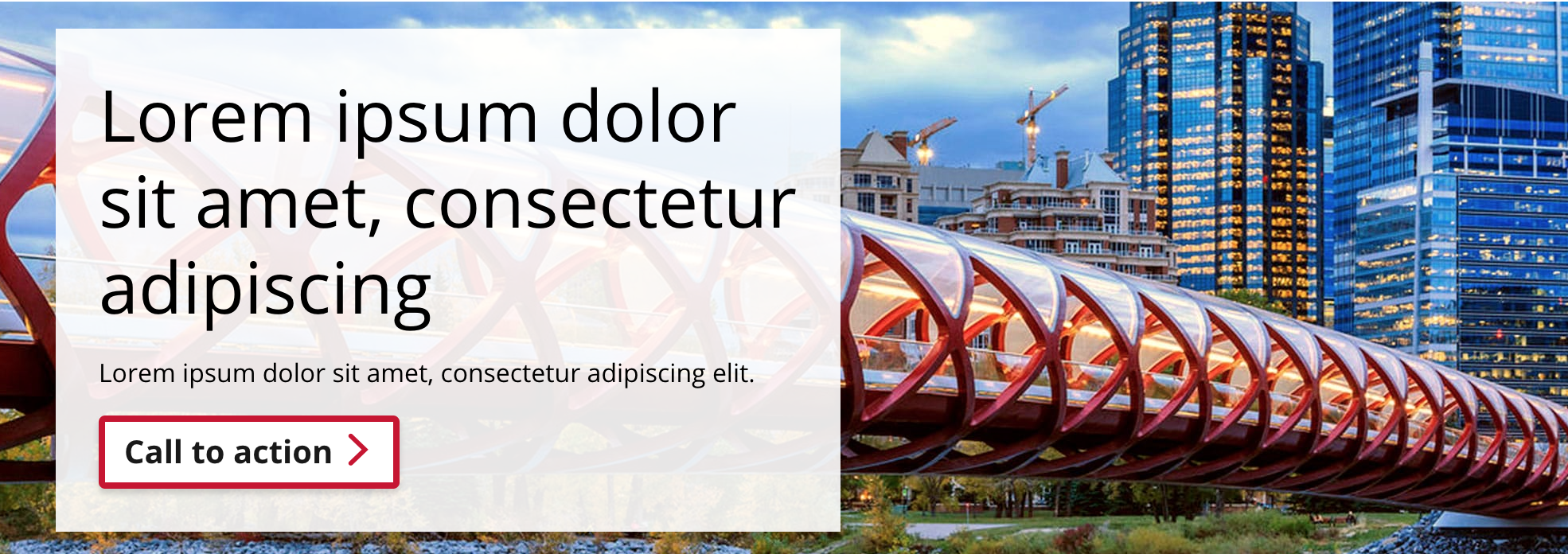
Hero banner with CTA
In this variant, a Call to Action is placed in the content section of the hero banner. The Call to Action text should be short and simple. There are various background colour and alignment options available for the content section.
The background image should be at least 1280px by 350px.
Limit the hero banner heading and paragraph text so the content section does not overflow the pattern.
Demo
Use the select boxes below to see the available configurations.
Title lorem ipsum dolor sit amet
Lorem ipsum dolor sit amet, consectetur adipiscing elit.
Call to actionCode
<!-- The following modifier classes may be applied to the `cta-background` element.
Background colour:
- Use the class `coc-white-opacity` for a transparent white background
- Use the class `coc-black-opacity` for a transparent black background
Alignment:
- By default, the text alignment is centred
- Use the class `cta-left` to align the content box left
- Use the class `cta-right` to align the content box right
-->
<div class="cui coc-jumbotron">
<div class="background-image" style="background-image: url( '{{ Image URL (e.g. image.jpg) }}' );"></div>
<div class="cta-background {{ coc-white-opacity | coc-black opacity }} {{ cta-left | cta-right }}">
<h1>{{ Title }}</h1>
<p>{{ Content }}</p>
<a href="{{ URL }}" class="cui btn-lg primary">
{{ Call to action text }}<span class="cicon-angle-right right" aria-hidden="true"></span>
</a>
</div>
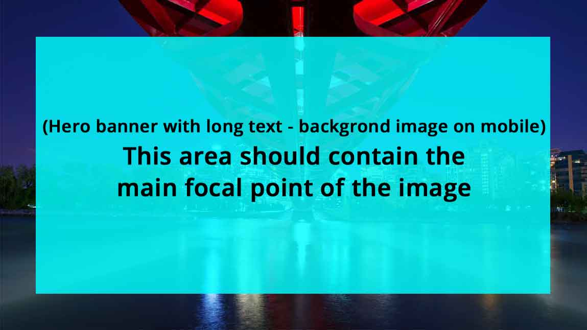
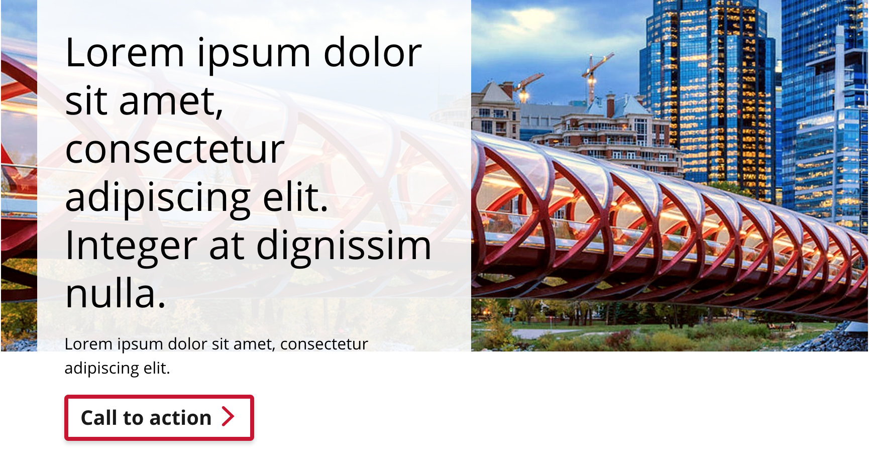
</div>Hero banner with long text
In this variant, content can flow without sizing or length constraints. Multiple paragraphs of content may be added to the hero banner.
The hero image may be set to one of three different heights: small, medium, or large. These are fixed heights set through CSS and kick in depending on the screen size.
Demo
Lorem ipsum dolor Hendrerit velit dictum
Lorem ipsum dolor sit amet, consectetur adipiscing elit. Nulla sit amet sapien ut libero venenatis dapibus. Ut scelerisque sit amet sapien ac rutrum.
In sed vestibulum nunc. Suspendisse tristique metus ac auctor elementum. Suspendisse scelerisque ipsum sodales justo auctor maximus. Ut dignissim et neque eu interdum. Cras non massa metus.
Sed tempus egestas dui, ac lacinia nibh molestie sit amet. Praesent eu elit felis. Nullam vitae nulla justo. Donec rhoncus imperdiet sodales. Fusce malesuada nunc est, sit amet consequat eros efficitur ac. Donec in interdum erat. Praesent vel gravida massa. Pellentesque tellus dolor, aliquet malesuada diam sit amet, pulvinar cursus magna.
Code
<div class="cui hero-banner-long-text">
	<div class="hero-media">
		<img class="mobile-image" src="{{ Image URL (e.g. image.jpg) }}" alt="">
		<div class="background-image {{ sm | md | lg }}" style="background-image: url( '{{ Image URL (e.g. image.jpg) }}' );"></div>
	</div>
	<div class="hero-body row">
		<div class="col-single-narrow">
			<div class="hero-body-inner">
				<h1 class="title">
					<span class="context-title">{{ Context title }}</span>
					{{ Title }}
				</h1>
				<p>{{ Content }}</p>
			</div>
		</div>
	</div>
</div>Usage
General guidelines
Hero banners should be used at the top of the page under the navigation bar.
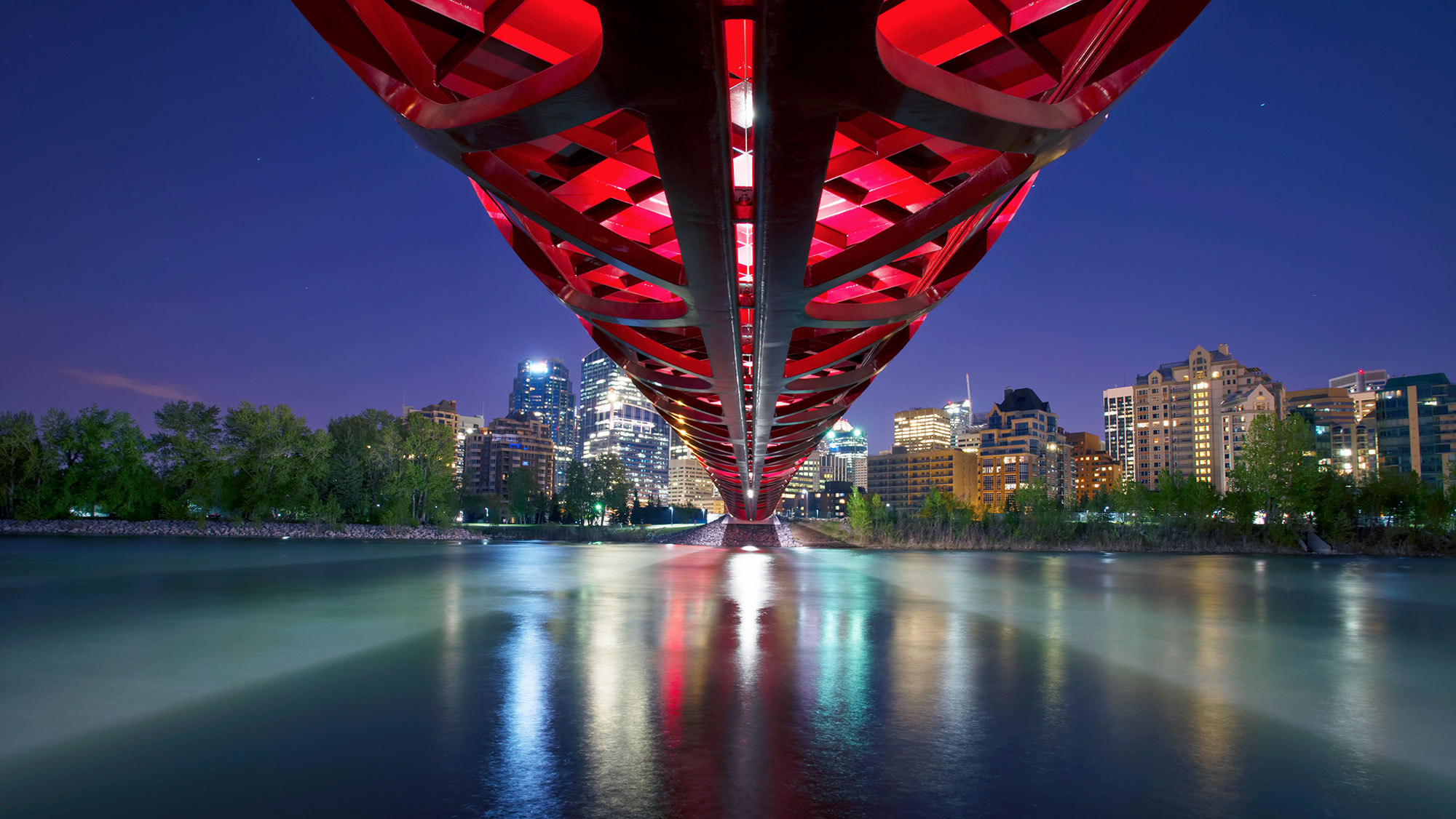
Background image guidelines
- Hero banners must always have a background image.
- There is no default background image, you will need to supply an image.
- Use high quality images which can scale to fit numerous screen sizes and aspect ratios with plenty of visual white space around the edges.
- Ensure the image choice relates to the topic for which the banner will be used.
- Do not use images with important details close to the sides of the image. Do not use images with embedded text.
- Do not embed text into the image.
Text guidelines
Hero banner with CTA
- The recommended character limit for the title is 50 characters.
- The recommended character limit for the title is 80 characters.
- Do not write long sentences for the title and decription text.
Background image template
A background image template is available to guide the placement of the image’s focal point. This ensures the image is displayed properly when the pattern is viewed across various screen sizes.