Interactive bar chart table
The interactive bar chart pattern allows users to visually see a percentage breakdown of a specified value, split into multiple categories. These categories could contain a further second-level breakdown.
There are several components comprising the interactive bar chart:
- User input field
- Bar chart table
- Data table
- Table legend
- Share (optional)
An example application of this pattern would be to display the percentage and dollar breakdown of a property tax bill. The dollar amount would be entered into the input field and a script would calculate and display the corresponding dollar amount of each category. For categories that have a second-level breakdown, the user could click the Details button to see more information.
Demo
- Enter a value in the form field. Click the Calculate button.
- A new column will be added to indicate the price breakdown, based on the value entered into the form field.
- Click the Details button to see a further breakdown.
- Click to reset the demo.
Code
<!--
- The `more-details` class should be applied to the <tr> if there is the second-level breakdown available.
- The `action-column` should only contain the call to action button. On second-level items, the column should be left blank.
- The `expand-row` row is hidden by default until JavaScript toggles it open.
- On the `data-bar-inner` element, an inline width style is required. This width percentage should be the same as the corresponding value in the Percentage (%) column.
- There are 3 colours available for the bar graph:
	- Firs-level colour (#00a3e0) - defult color:	<span class="data-bar-inner"></span>
	- Second-level colour (#005670): <span class="data-bar-inner darker"></span>
	- Highlight colour pattern:		 <span class="data-bar-inner {{ highlight }}"></span>
-->

<!-- Scripts to handle toggling the Details buttons are not available at this time. -->
<script src="js/jquery-2.2.4.min.js"></script>
<script src="js/jquery.validate.min.js"></script>
<script src="js/coc.forms.js"></script>
<script>
	$( document ).ready( function() {
		COC.Form.initValidation();
	});
</script>

<!-- User input field -->
<form data-pl-frm-vld="true">
	<h2 class="bar-chart-title">{{ Bar chart title }}</h2>
	<div class="cui bar-chart-input d-flex justify-content-center">
		<div class="mr-xxs">
			<label for="{{ Input id }}" class="sr-only">{{ Label }}</label>
			<input id="{{ Input id }}" name="{{ Input name }}" type="number" min="0" class="form-control" placeholder="{{ Placeholder text (e.g. 100) }}">
		</div>
		<button class="cui btn-md primary btn-form-control" type="button">{{ button text (Calculate) }}<span class="cicon-angle-right right" aria-hidden="true"></span></button>
	</div>
</form>

<!-- Bar chart table -->
<div class="bar-chart">
	<table class="bar-chart-table">
		<caption>{{ Table caption }}</caption>
		<thead>
			<tr>
				<th scope="col" class="col-lg-3">{{ Table heading (e.g. Category) }}</th>
				<th scope="col" class="raw-data col-10 col-sm-11 col-md-10 col-lg-7">{{ Table heading (e.g. Percentage (%)) }}</th>
				<th scope="col" class="output-data col-2 col-sm-2 col-lg-1">{{ Table header (e.g. Amount) }}</th>
				<th scope="col" class="action-column col-2 col-sm-1 col-md-2">{{ Table heading (e.g. Breakdown) }}</th>
			</tr>
		</thead>
		<tbody>
			<!-- If there are second-level items in the row, add the class `more-details`. -->
			<tr class="{{ more-details }}">
				<th scope="row" class="col-12 col-lg-3">{{ Table row header (e.g. Service name) }}</th>
				<td class="raw-data col-10 col-sm-11 col-md-10 col-lg-7">
					<span class="data col-12 col-lg-2">{{ Data number (e.g. 50%) }}</span>
					<span class="data-bar col-12 col-lg-10" aria-hidden="true">
						<!-- The inline width value should be the same number as the data number above.
							 The default bar graph color is light blue and is always applied to the first level.
							 To use the highlight variant, use the `highlight` class. -->
						<span class="data-bar-inner {{ highlight }}" style="width: {{ Percentage (e.g. 50%) }};"></span>
					</span>
				</td>
				<td class="output-data col-2 col-sm-2 col-lg-1">
					<!-- There are two result texts available. The first result text is optimized for visual users and hidden for screen readers.
						 The second result text is optimized for screen reader users and is hidden for visual users. -->
					<span class="result" aria-hidden="true" >{{ Output result (e.g. $100) }}</span>
					<span class="result sr-only">{{ Output result (e.g. 100 dollars) }}</span>
				</td>
				<td class="action-column col-2 col-sm-1 col-md-2">
					<!-- Use JavaScript to configure the button toggle actions when the button is activated -->
					<button class="cui btn-sm secondary-text" aria-expanded="false">
						<span class="text">Details</span>
						<span class="cicon-angle-down right" aria-hidden="true"></span>
					</button>
				</td>
			</tr>
			<!-- Second-level rows need the class `expand-row`. -->
			<tr class="expand-row">
				<th scope="row" class="col-12 col-lg-3"><a href="{{ URL }}">{{ Sub-item name }}</a></th>
				<td class="raw-data col-10 col-sm-11 col-md-10 col-lg-7">
					<span class="data col-12 col-lg-2"></span>
					<span class="data-bar col-12 col-lg-10" aria-hidden="true">
						<!-- The value for the inline width style depends on the parent data number.
							 If the parent data is 50% and there is only one sub-service under the parent, the inline style width value is 50%.
							 The bar graphs for second-level items should use the class `darker`. -->
						<span class="data-bar-inner darker" style="width: {{ Percentage (e.g. 50%) }};"></span>
					</span>
				</td>
				<td class="output-data col-2 col-sm-2 col-lg-1">
					<!-- There are two result texts available. The first result text is optimized for visual users and hidden for screen readers.
						 The second result text is optimized for screen reader users and is hidden for visual users. -->
					<span class="result" aria-hidden="true">{{ Output result ($50) }}</span>
					<span class="result sr-only">{{ Output result (50 dollar) }}</span>
				</td>
				<!-- No action item is necessary for a second-level item. Leave this column blank. -->
				<td class="action-column col-2 col-sm-1 col-md-2"></td>
			</tr>
		</tbody>
	</table>

	<!-- Table legend -->
	<div class="bar-chart-legend mb-lg">
		<h3 class="legend-title">{{ Legend }}</h3>
		<div class="row">
			<div class="col-md-4">
				<span class="data-bar"><span class="data-bar-inner highlight" aria-hidden="true"></span></span>{{ Label }}
			</div>
			<div class="col-md-4">
				<span class="data-bar"><span class="data-bar-inner" aria-hidden="true"></span></span>{{ Label }}
			</div>
			<div class="col-md-4">
				<span class="data-bar"><span class="data-bar-inner darker" aria-hidden="true"></span></span>{{ Label }}
			</div>
		</div>
	</div>

	<!-- Share (optional) -->
	<div class="bar-chart-share mb-sm text-center">
		<h3 class="share-title">{{ Share title }}</h3>
		<p>{{ Content }}</p>
		<div class="row row-compact justify-content-center">
			<div class="col-6 col-sm-4 col-md-2">
				<a class="cui btn-mega utility-btn btn-fluid" href="{{ URL }}" target="_blank">
					<span class="{{ Icon class (e.g. cicon-twitter-square) }} cl top"> aria-hidden="true"</span>
					<span class="text">{{ Button text }}</span>
				</a>
			</div>
			<div class="col-6 col-sm-4 col-md-2">
				<a class="cui btn-mega utility-btn btn-fluid" href="{{ URL }}" target="_blank">
					<span class="{{ Icon class (e.g. cicon-facebook-square) }} cl top"> aria-hidden="true"</span>
					<span class="text">{{ Button text }}</span>
				</a>
			</div>
		</div>
	</div>
</div>Usage
General guidelines
Individual bar chart titles
Please DO 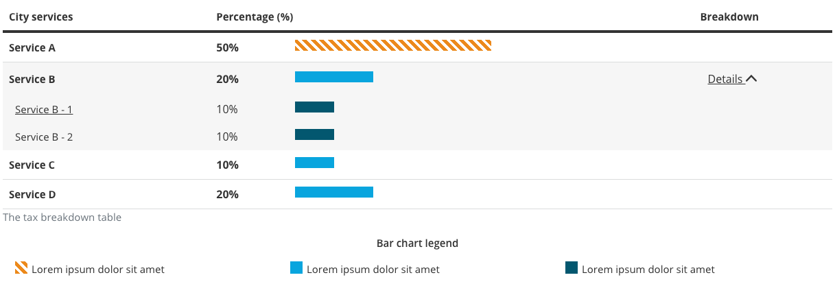
- It is important that the title is easy to read and understand. Keep the title short and clear.
Please DON’T 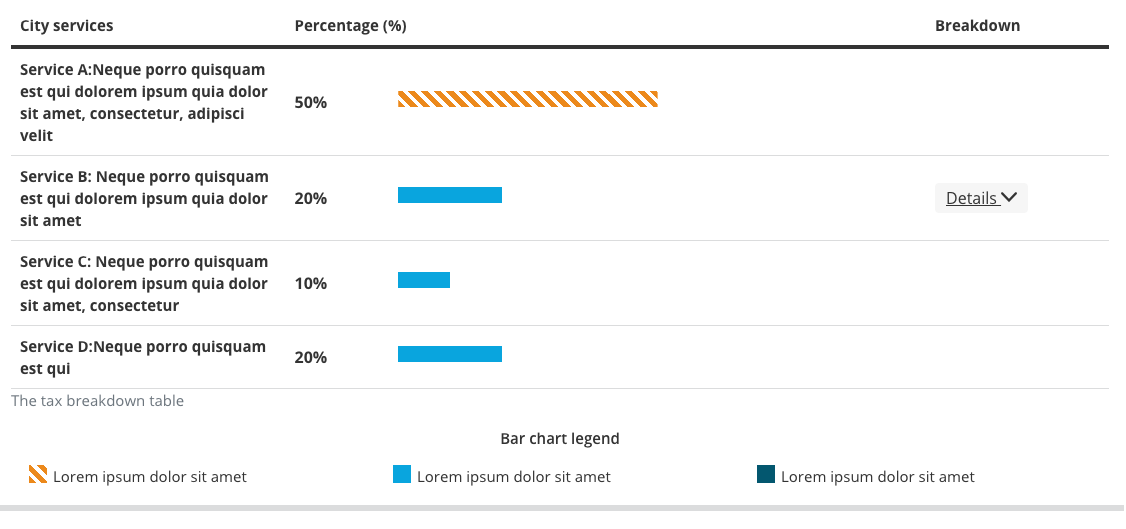
- Do not make the bar chart title unnecessarily long.
Breakdown levels
Please DO 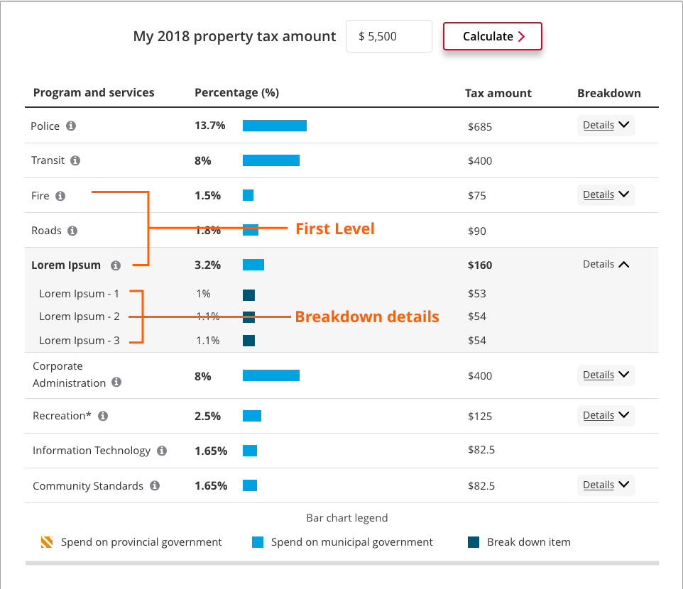
- The bar chart supports up to 2 levels.
Please DON’T 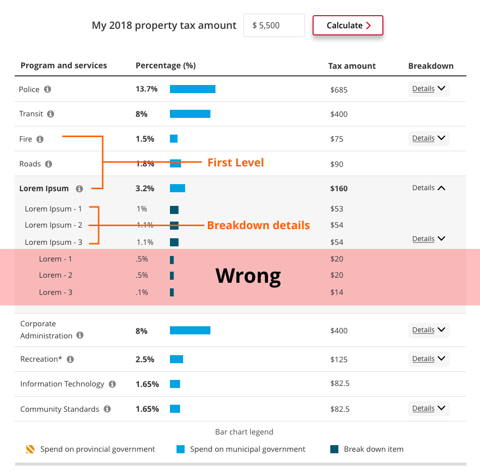
- Do not add more than 2 levels.
Anatomy
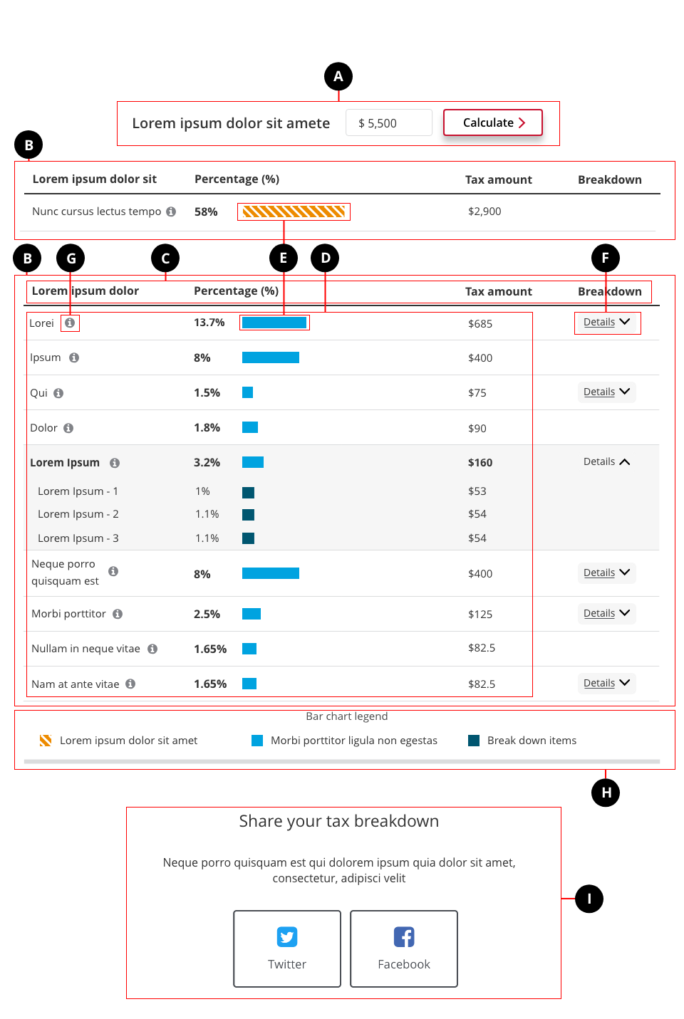
- User input (optional)
- Table (required)
- Table header (required) - Contains the column headers. There should be no more than 5 columns.
- Table content (required) - The data
- Bar chart (required) - Visualizes the data
- Text button (optional) - Allows the user to see the second-level breakdown
- Tooltip (optional) - Provides additional supplementary information to the user
- Legend (required) - Indicates the meaning of each bar chart colour
- Sharing (optional, recommended) - Gives user the option to share the page through social media. Contains the heading, short description, and share buttons.