Tooltip
Tooltips contain short static information that is hidden until a user hovers or clicks the tooltip button. The content should be supplementary information that is not essential to the primary tasks for the page.
Tooltips may only be applied to <button class="cui btn-tooltip"> elements. The sole purpose of the tooltip button is to display the tooltip. Do not apply the tooltip to buttons with functional purposes (e.g. form submission buttons, hide/show buttons, etc). Doing so will compromise accessibility.
Demo
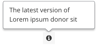
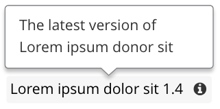
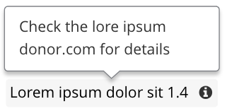
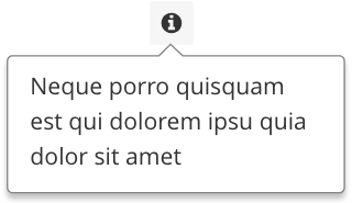
Tooltip button with text and icon
Tooltip button with icon only
Placement
The default placement of the tooltip is to the top of the button. This placement may be customized by setting the data-placement attribute on the button. Accepted values are: top, right, and bottom.
Note: Popper.js will adjust the placement of the tooltip if there is not enough room in the specified direction. For example, resize your browser window to a mobile size and activate the Tooltip on right button. There will not be enough room on the right of the button, so the tooltip will be placed on top instead.
Code
<!-- Scripts -->
<script src="js/jquery-2.2.4.min.js"></script>
<script src="js/popper-1.14.4.min.js"></script>
<script src="js/coc.tooltip.js"></script>

<!-- Tooltip button with text and icon -->
<button role="button" class="cui btn-tooltip btn-md"
aria-label="{{ Label for Assistive Technology users }}"
data-title="{{ Tooltip message (static text only) }}"
data-placement="{{ top (default) /  right / bottom }}">
    <!-- Add the `right` class to space the icon from the text -->
    {{ Button text }}<span class="icon-tooltip right" aria-hidden="true"></span>
</button>

<!-- Tooltip button with icon only -->
<button role="button" class="cui btn-tooltip btn-md"
aria-label="{{ Label for Assistive Technology users }}"
data-title="{{ Tooltip message (static text only) }}"
data-placement="{{ top (default) /  right / bottom }}">
    <span class="icon-tooltip" aria-hidden="true"></span>
</button>Usage
General guidelines
- Do use short descriptive text for the tooltip content. The recommended maximum character limit is 145.
- The tooltip text must be supplementary and non-essential to the primary tasks for the page.
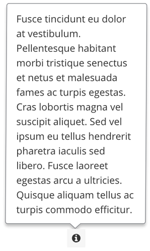
- Do not make the tooltip content too long.
- Do not use information that is essential to fulfill the primary task of the page.
- Do use plain, static text for the tooltip content.
- Do not use interactive or rich text for the tooltip content. Only plain text will work.
- The tooltip can only be applied to a
<button>with the classescui btn-tooltipand one of the four button sizing classes availablebtn-sm,btn-md,btn-lg, orbtn-xl. The recommended button size isbtn-md. - The tooltip icon must be
cicon-info-circle. This icon is already built in through the CSS.
- Do not apply the tooltip to a non-
<button>element. In addition, do not try to wrap the button around a group of elements. - Do not use a different icon other than the built-in icon in the CSS. For consistency, the icon for all tooltip buttons should be the same.
Accessibility
Pattern Library tooltips follow the WCAG 2.1 accessibility success criterion for content on hover or focus:
-
Dismissable: A mechanism is available to dismiss the tooltip without moving pointer hover or keyboard focus.
Pattern Library tooltips may be dismissed by pressing theEscorTabkey. - Hoverable: The pointer may be moved over the tooltip text without the tooltip disappearing.
-
Persistent: The tooltip remains visible until the hover is moved, the focus trigger is removed, or the user dismisses it.
Pattern Library tooltips display when the button is hovered and are dismissed when hovered off of the button or tooltip. They are also displayed when the button is clicked and are dismissed when the user clicks outside of the button or tooltip. Pattern Library tooltips do not display when the button is focused.
Tooltips utilize the third party library Popper.js. popper-1.14.5.min.js must be included before coc.tooltip.js.
Tooltips may only be applied to <button> elements. The sole purpose of the tooltip button is to display the tooltip. Do not apply the tooltip to buttons with functional purposes (e.g. form submission buttons, hide/show buttons, etc). Tooltip buttons are designed to open the tooltip message on click or hover. By mixing tooltip buttons with other functional buttons, accessibility becomes compromised.
Tooltip buttons must utilize the classes cui btn-tooltip and one of the four button sizing classes available btn-sm, btn-md, btn-lg, or btn-xl. The recommended button size is btn-md. Using the button size classes allows for consistent spacing and padding when other buttons are placed beside the tooltip buttons.
The aria-label attribute is the label for Assistive Technology users. This label should be fairly short and succinct as it will be read aloud by screen readers when the button is focused. Example: aria-label="Provincial property tax tooltip"
The data-title attribute contains the text for the tooltip. The text must be plain and static. The text should not contain any HTML including bold, italic, or link tags. The recommended maximum character limit is 145.