Responsive images
Basic responsive images
Code
<img src="{{ Image URL (e.g. image.jpg) }}" alt="{{ Alternative text }}">Applying percentage widths
A percentage width can be applied to images so the image size is relative to the container it is inside of. The image will keep its aspect ratio and proportions.
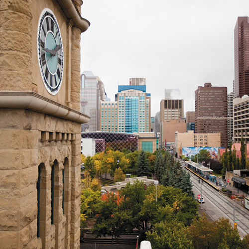
Below is an example where the image is given a width of 50% (relative to its container).
Integer posuere erat a ante venenatis dapibus posuere velit aliquet. Aenean lacinia bibendum nulla sed consectetur. Nulla vitae elit libero, a pharetra augue. Fusce dapibus, tellus ac cursus commodo, tortor mauris condimentum nibh, ut fermentum massa justo sit amet risus. Cum sociis natoque penatibus et magnis dis parturient montes, nascetur ridiculus mus. Maecenas sed diam eget risus varius blandit sit amet non magna. Integer posuere erat a ante venenatis dapibus posuere velit aliquet. Aenean lacinia bibendum nulla sed consectetur. Nulla vitae elit libero, a pharetra augue. Fusce dapibus, tellus ac cursus commodo, tortor mauris condimentum nibh, ut fermentum massa justo sit amet risus. Cum sociis natoque penatibus et magnis dis parturient montes, nascetur ridiculus mus. Maecenas sed diam eget risus varius blandit sit amet non magna.
Code
<img class="{{ cui-width-100 | cui-width-75 | cui-width-50 | cui-width-25 }} {{ float-right | float-left }}"
src="{{ Image URL (e.g. image.jpg) }}" alt="{{ Alternative text }}">Usage
General guidelines
Sizing
When working with images on your page or application, avoid applying a fixed width or height. This allows the image to be responsive on the page layout. By default, images in the Pattern Library have been styled to have a max-width of 100% applied to them.
Images will shrink or expand to fill their container, up to their maximum width.
Alt text
The alt attribute defines an alternative text description of the image. This text is used for assistive technologies when users may not be able to see the image. In addition, should the image not load correctly (e.g. due to a slow internet connection), the alt text will be displayed instead.
- All
<img>tags should contain analtattribute with useful, descriptive text, unless the image is used for decorative purposes only. - If the image is wrapped inside a link, explain where the link will go. Example:
alt="Return to the Calgary.ca homepage" - For images that are used for decorative purposes only, set the alt attribute to an empty string:
alt="". This indicates to assistive technologies that it has no importance to the page.