Contact information block
Contact information block
Provides consistent layout with options for connecting with a person, place, organization, etc
Can be used stand-alone within a page or in a series of contact blocks.
Simon G. Lagann
Division Head, Team Gurren
Neque porro quisquam est qui dolorem ipsum quia dolor sit amet, consectetur, adipisci velit.
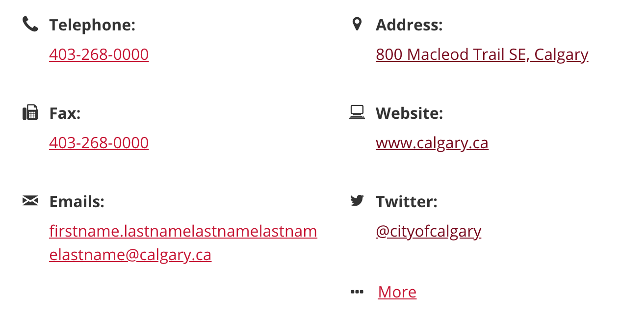
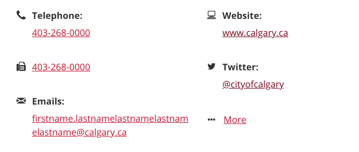
Telephone: 403-268-0000
Fax: 403-268-0000
Emails: firstname.lastname@calgary.ca
Address:
Website:
Twitter:
Mobility White cane
Code
<div class="cui contact-info row no-gutters {{ bg-light | bg-medium | bg-transparent }} {{ constrained }}">
	<div class="contact-media {{ col-sm-3 }}">
		<!--ratio-16x9 ratio-4x3 ratio-3x4-->
		<div class="background-image {{ ratio-1x1 | ratio-16x9 | ratio-4x3 | ratio-3x4 }} {{ bg-pos-x-left | bg-pos-y-top | bg-pos-x-center | bg-pos-y-center | bg-pos-x-right | bg-pos-y-bottom }}" style="background-image: url( '{{ Image URL (e.g. image.jpg) }}' );">
		</div>
	</div>
	<div class="contact-body {{ col-sm-9 | col-sm-12 }}">
		<h3 class="contact-title">{{ Title }}</h3>
		<p class="subtitle">{{ Subtitle }}</p>
		<p id="demo-description">{{ Description }}</p>
		<div id="data-items" class="{{ col-count-1 | col-count-2 | col-count-3 }}">
			<p class="cui icon-label-group {{ hide-icon }}">
				...
			</p>
			<p class="cui icon-label cui-width-100 {{ hide-icon }}">
				...
			</p>
		</div>
	</div>
	<!--Optional CTA footer-->
	<div class="contact-footer col-12 text-center">
		<!--Combinations for the CTA-->
		<!--Option 1: Utility CTA-->
		<a class="cui btn-md utility-btn-solid" href="#">
			{{ CTA text }}
			<span class="cicon-angle-right right" aria-hidden="true"></span>
		</a>

		<!--Option 2: Utility with Secondary /text CTA-->

		<a class="cui btn-md utility-btn-solid" href="#">
			{{ CTA text }}
			<span class="cicon-angle-right right" aria-hidden="true"></span>
		</a>
		<a class="cui btn-md secondary-text" href="#">
			{{ CTA text }}
		</a>
	</div>
</div>Usage
General guidelines
Contact informations are displayed on the right side content area, including
- Title (e.g. Personal name, facility name) - required
- Subtitle (e.g. job title ) - optional
- Description - optional
- Data group items - optional
Individual data group items
- Each data group item can be:
- a single value (i.e. a phone number or e-mail address), or .
- comprised of multiple lines of values (i.e. mailing address)
- Each data group item:
- must be displayed as a distinct block (don't run separate items - such as two phone numbers - together in one block)
- must only contain alphanumeric information (no buttons, images, or social media feeds, etc) i.e. a Twitter link should display the contact's Twitter handle, not just the Twitter icon
- may contain links
- must not contain action-based wording, such as "call now" - that is reserved for the Contact Actions/CTA section
- While common contact information items exist (i.e. phone, email), no specific contact information type is required when using the contact block pattern (as long as at least one is used).
- Less common types of contact information unique to some contacts may be used with a contact block pattern, as long as requirements for labeling and layout are still met.
- Contact data items may or may not be displayed with an associated label or icon.
Data item labels
Labels are displayed on a separate line above the contact data they relate to. They provide clarity for the context of the data item (i.e. "Telephone","Fax" or "Main number", "After-hours number")
Labels may be applied to individual data items or to all data items in the contact block
When more than one contact data item is of the same type (i.e. two phone numbers, two email addresses, two addresses), a label must be applied to each.
Data item icons
Icons can help provide visual cues to the type of contact data and add to the 'scanability' of each block.
If an icon is used for any item in a column, an icon must also be used for all items in the block.
Note that icons do not replace the need for using labels (but can supplement them).
Contact Actions/CTA section
An optional CTA (call-to-action) section outlines how users may be invited to interact with a contact (vs data items that just provide contact data itself).
This is shown as a separate section at the bottom of the contact block, and can contain one or two CTA messages (one primary action and one secondary action).
Each call-to-action:
- Can make use of a contact method already displayed in the contact data (i.e. a phone number can be shown in the contact data and within the CTA section)
- Must provide a context of action, not just the data itself ("call", "book", "contact", "visit").
- Must not use a generic label such as "Contact Us" or "Call Now": Each CTA must be specific to the contact or context-of-use. i.e. "Contact Joe", "Book the Allen Room today")
Contact image
An optional image represents the person, place, or organization to be contacted.
The image is always viewed in its entirety.
Different aspect ratios can be used to best suit how the contact block is being applied. (However, a square 1:1 aspect ratio is recommended for content likely to be viewed in both full-width and mobile layouts)
When used, a contact image:
- with the exception of a placeholder image, must be a direct representation of the person, place, or organization (and not an abstract image)
- must not be distorted
Data group item layout options:
Three layout options are available for data group items:
- One column
- Two columns
- Three columns
In a mobile browser (or in other smaller-width displays), two- and three-column layouts will reflow into single column layouts.
Stacked layout option:
This always displays the contact block in a single-column layout (i.e. all information is "stacked" in one column)
When used as a single item in content or a right-rail, this option allows the contact information block to be constrained by that containing section, rather than the page.
It can also be used to show multiple contact blocks side-by-side, rather than as full-page width
Using multiple contact information blocks in the same page:
When used as a series of contact blocks:
Each contact block must use the same layout and display options:
- contact images (if one item of a series has no images, and others do, apply a placeholder image for that contact block)
- number of columns
- using icons
When some contact information blocks in a series have CTA sections, others do not need to.
As well, each contact information block in the series:
- must list data group items in the same order
- must use the same labels for the similar data group items
When CTA sections are applied to contact information block in a series, the actions (i.e. "Call", "Contact", "Book") do not need to be the same for each block (it is recommended they are the same action, but this is not required).