Text on image
The text on image pattern provides a stylized opttion to display a brief amount of content with a decorative image.
Text on image - content
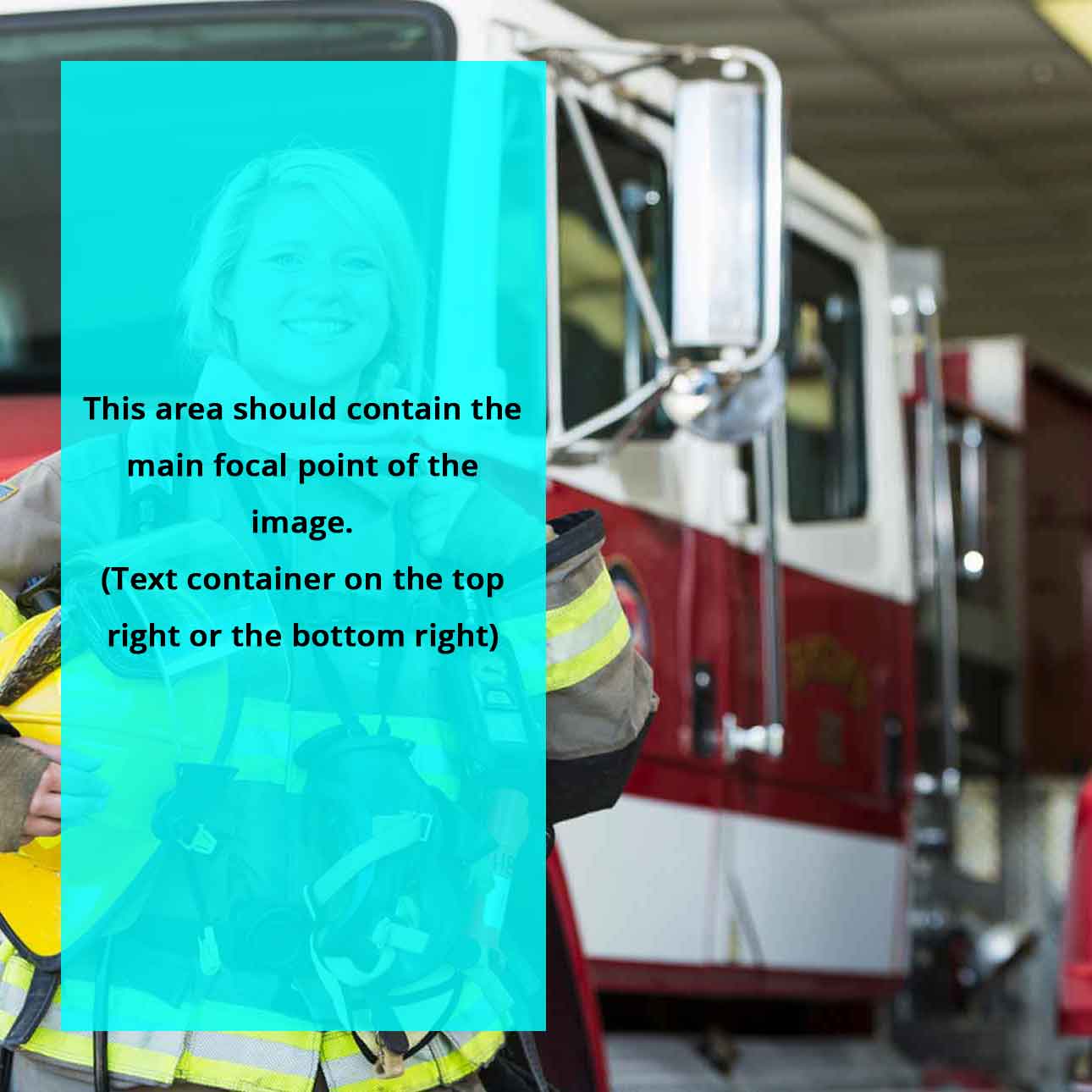
Choose a square image where the focal point of the image is on left or right side. The text should be positioned appropriately to any of the four corners and should not obscure the image’s focal point.
The pattern has a fluid width; therefore, it is recommended to limit the width of its parent container so it does not render too large. A custom responsive Bootstrap grid column class has been created for this purpose. Insert the pattern into a column with the class col-single-narrow. This column has a narrower width and is responsive based on the browser window width.
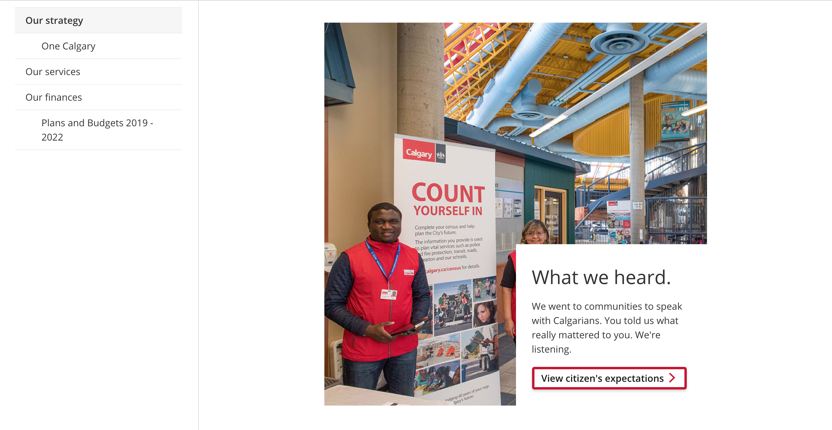
Demo
Nam hendrerit velit et dictum
Consectetur adipiscing elit. Phasellus vestibulum ex ex, sed sodales massa eleifend.
Code
<div class="row justify-content-center">
	<!-- Change the Bootstrap column classes as necessary or use another method to limit the width of the pattern. -->
	<div class="col-11 col-sm-9 col-md-8 col-lg-7">
		<div class="cui text-on-image">
			<div class="comp-media">
				<!-- Background image positions will work depending on the ratio. The bg-pos-x classes only works with ratio-3x4, while the bg-pos-y classes work with ratio-16x9 and ratio-4x3 -->
				<div class="background-image {{ ratio-16x9 | ratio-4x3 | ratio-1x1 | ratio-3x4 }} {{ bg-pos-x-left | bg-pos-x-center | bg-pos-x-right }} {{ bg-pos-y-top | bg-pos-y-center | bg-pos-y-bottom }}" style="background-image: url( '{{ Image URL (e.g. image.jpg) }}' );"></div>
			</div>
			<!-- Select one of the 4 positioning classes to position the content. -->
			<div class="comp-body {{ top-left | top-right | bottom-left | bottom-right }}">
				<span class="context-title">{{ Context title }}</span>
				<h2 class="title">{{ Title }}</h2>
				<p>{{ Content }}</p>
			</div>
		</div>
	</div>
</div>Usage
General guidelines
Colour text block - content
The pattern has a fluid width; therefore, it is recommended to limit the width of its parent container so it does not render too large.
- Do limit the width of the pattern so it does not render too large on the page. e.g. place it inside of a grid column.
- Do not place the pattern in the main content area without limiting the width. If the width is not limited, the pattern will render too large and will not fit the screen.
Background image template
A background image template is available to guide the placement of the image’s focal point. This ensures the image is displayed properly when the pattern is viewed across various screen sizes.