Background images
The utility class background-image along with the utility ratio classes can be used together to set a background image on an element. The ratio class sets up the dimensions of the element and the background image fills the entire area.
This option can be more flexible than simply using the <img> tag. The image will be displayed in the chosen ratio regardless of the image’s actual physical dimensions.
The background-size attribute is set to cover. According to the MDN web docs, the cover value “scales the image as large as possible without stretching the image. If the proportions of the image differ from the element, it is cropped either vertically or horizontally so that no empty space remains.”
Background image ratios
The 4 fixed ratio sets for background image:
| Ratio | Class name |
|---|---|
| 16x9 | ratio-16x9 |
| 4x3 | ratio-4x3 |
| 1x1 | ratio-1x1 |
| 3x4 | ratio-3x4 |
Example - fixed ratio sets
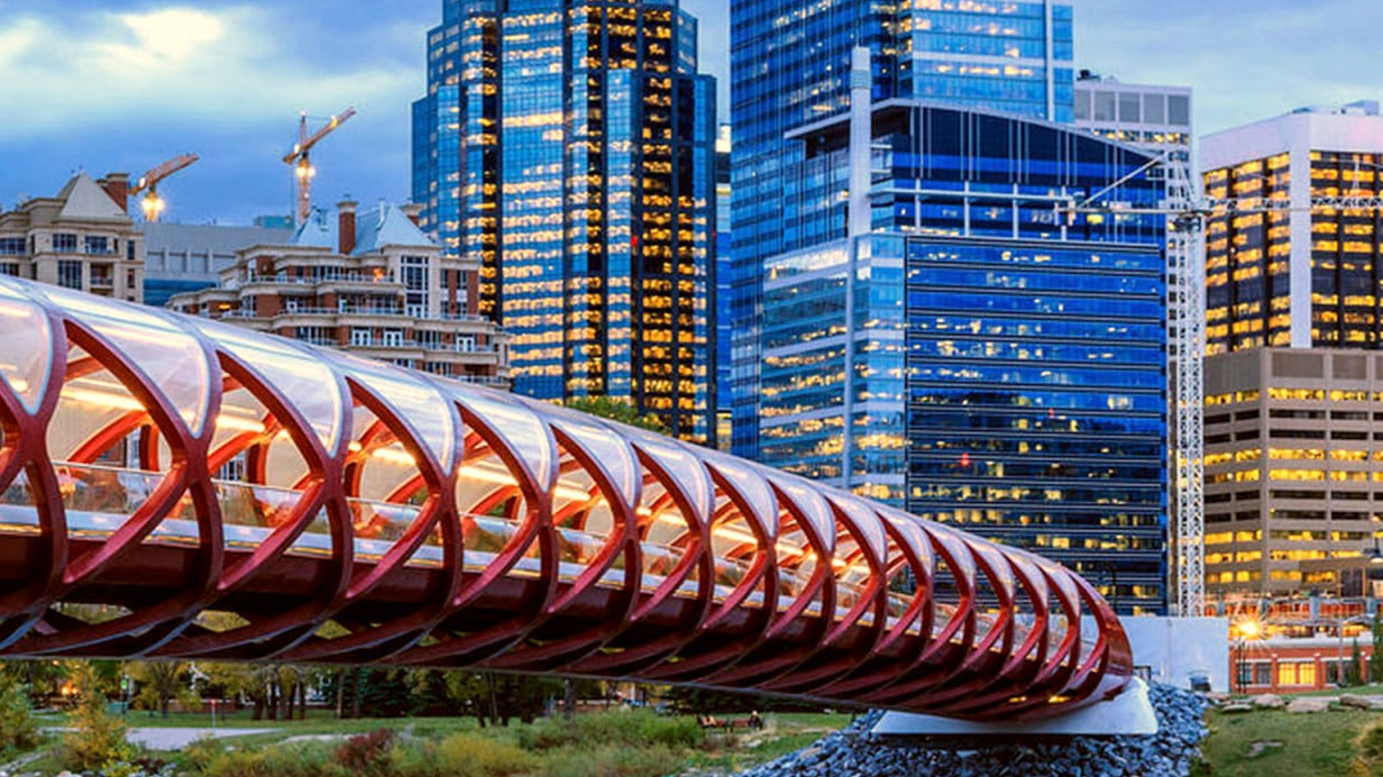
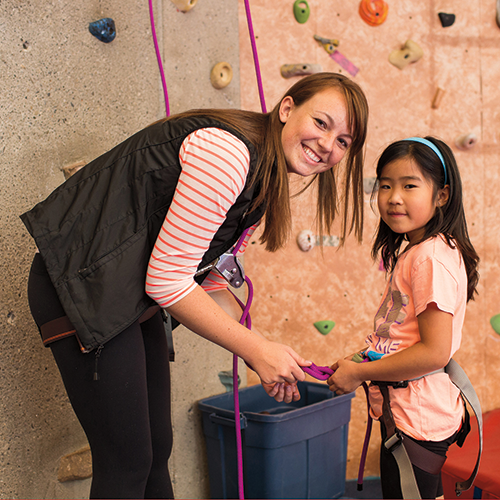
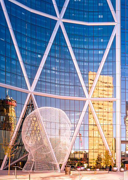
Each of the 4 examples below are using the same image. The image may appear to be cropped as the image’s physical ratio is different than the ratio class applied.
The 3 custom ratio sets for background image:
| Custom aspect ratios | Class name |
|---|---|
| Small | ratio-custom-sm |
| Medium | ratio-custom-md |
| Large | ratio-custom-lg |
Example - Custom aspect ratio
The custom aspect ratio has fixed height on tablet and desktop. On mobile the background image ratio will always be 16x9.
Code
<!--Fixed ratio sets-->
<!-- 16x9 -->
<div class="background-image ratio-16x9" style="background-image: url( '{{ Image URL (e.g. image.jpg) }}' );"></div>

<!-- 4x3 -->
<div class="background-image ratio-4x3" style="background-image: url( '{{ Image URL (e.g. image.jpg) }}' );"></div>

<!-- 1x1 -->
<div class="background-image ratio-1x1" style="background-image: url( '{{ Image URL (e.g. image.jpg) }}' );"></div>

<!-- 3x4 -->
<div class="background-image ratio-3x4" style="background-image: url( '{{ Image URL (e.g. image.jpg) }}' );"></div>

<!--custom ratio sets-->
<div class="background-image {{ ratio-custom-sm ratio-custom-md ratio-custom-lg }}
" style="background-image: url( '{{ Image URL (e.g. image.jpg) }}' );"></div>Background image positioning
The default focus or positioning of the background image is set to the horizontal and vertical center.
By using the background-position utility classes, the positions can be customized on the x and y basis. There are a total of 9 possible combinations. Apply the classes to the background-image element.
| Horizontal position class name | Vertical position class name |
|---|---|
| bg-pos-x-left | bg-pos-y-top |
| bg-pos-x-center | bg-pos-y-center |
| bg-pos-x-right | bg-pos-y-bottom |
Background position demo
Below is a demonstration of the 9 possible background positioning combinations. Mix and match the images and ratios to see the background positions in action.
Note: Depending on the image’s physical ratio and the applied ratio, the background positioning classes may show no effect. The background positioning is most noticeable if the image’s physical ratio is different than the applied ratio.
1. Select an image


